Product Updates Updates

User Feedback πŸ“£

by Laurent Pellegrino, Founder & CEO
New
Newspages
Widgets

Last week we announced Emoji Reactions. Today, we are excited to introduce User Feedback!

This new feature allows your users to send you feedback by commenting on a post, directly from your Widget or Timeline. Comments are hidden, meaning users won’t be able to see others’ comments. Only your team and you are able to read messages and get users information.

How does it work?

User feedback is available with the Business plan. When creating a post, check the new User feedback option to enable the comment input below the post shown to users.

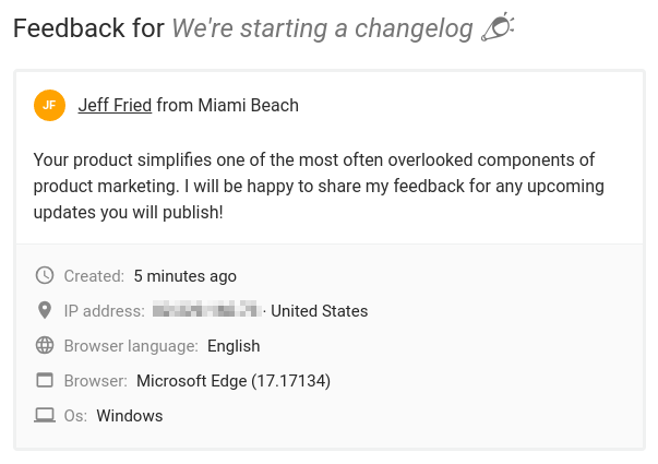
On your project dashboard, each post displays a feedback icon that summarizes the number of comments you received. Upon click, you can read the messages and get detailed information about the user who submitted the feedback:
User Feedback

By default, comments are anonymous. You can automatically link users name and email with comments sent from the Widget by using our SDK. Read the installation guide for more information.
Did you like this update?

LikeNeutralDislike

{error_message}

Leave your name and email so that we can reply to you (both fields are optional):

Thanks for your feedback!

Emoji Reactions πŸ™‚

by Laurent Pellegrino, Founder & CEO
New
Newspages
Widgets

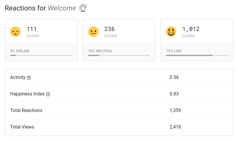
Today, we have a big update to share: Emoji Reactions. They are a fun, low-effort means for users to engage on updates and for you to better understand what people think.

Why Emoji Reactions?

Getting people to actively participate is key to developing stronger relationships. Users who engage consume, on average, 4 times as much content compared to passive users. Converting more passive users to active participants means more time on site, direct traffic, and audience loyalty.

How is it working?

Emoji Reactions are available with the Business and Enterprise plans right now. When you create/edit a post, you have a new option to enable/disable reactions. Upon publications, users can share their feeling about your update in just one click. Statistics are aggregated over time and made visible per post in your dashboard to analyze performances:

Screenshot from 2018-09-10 12-48-05.png

What do you think?

As you probably guessed, the Emoji Reactions feature is enabled for this post. Be sure to react to let us know what you think. If you have ideas or feedback, let us know by leaving a comment below.

Did you like this update?

LikeNeutralDislike

{error_message}

Leave your name and email so that we can reply to you (both fields are optional):

Thanks for your feedback!

Custom CSS

by Laurent Pellegrino, Founder & CEO
New
Newspages

promo-custom-css.png

It is now possible to inject your own Cascading Style Sheets (CSS) in your project Timeline. You can even override Noticeable’s predefined styles.

The option is available right now with the Enterprise plan. Simply open your project Timeline configuration page, then click on the new "Custom CSS" option from the side bar:

Screenshot from 2018-07-12 14-52-35.png

Below are some usage examples:

  • Increasing the font size:
body {
    font-size: 120%;
}
  • Adding a colorful banner on top of your Timeline:
body {
    border-top: 5px solid $project-accent-color;
}
  • Making labels monochrome:
 .label {
    background-color: #777 !important;
}

Custom Favicons

by Laurent Pellegrino, Founder & CEO
New
Newspages

A favicon is a small graphic that appears to the left of the page title but also in bookmarks. Having an image related to your brand is for users a strong indicator that they came to the right place, which can be reassuring in a sense.

Furthermore, favicons save time to your users: when you look at a web page, your eyes notice an image before the text surrounding it.

Screenshot from 2018-06-27 13-35-08.png

Starting Today, we are happy to offer the possibility to set your own favicon per project Timeline. Existing projects have been updated to include a favicon based on their logo.

If your Timeline doesn't have a logo or favicon yet, be sure to upload one from your project configuration page.

Multiple widget updates πŸš€

by Laurent Pellegrino, Founder & CEO
Announcement
Widgets

We have made several improvements to the Widget:

  1. Its definition is smaller. Fewer data to fetch, less time to first display. The Widget is now speedier than ever πŸ—²

  2. Setup instructions have been updated to reference a new script element. Instead of 4 line of codes, a single is now required to import the Widget definition:

    <script async defer src="https://cdn.noticeable.io/v1/noticeable-widget.js"></script>
    

    The async and defer attributes guarantee the content is loaded in parallel and executed after your page is parsed, no matter where the import is placed in.

    Although we recommend switching to the new import script, old ones remain available but are deprecated.

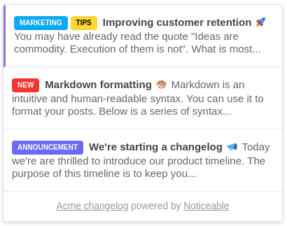
  3. Unread posts displayed in the Widget popup now include a left border. This allows distinguishing unread messages from read ones:

    Noticeable Widget Updates

    The color of the left border is based on the project accent color but can be changed programmatically. You can set it transparent to mimic the old style:

    <custom-style>
        <style>
            noticeable-widget {
                --noticeable-widget-popup-entry-unread-border-color: transparent !important;
            }
        </style>
    </custom-style>
    
  4. Widget but also Timeline code snippets are rendered with the Atom One Dark style to improve readability.